
8 Design related terms which hold high significance when creating amazing content and websites
by atul
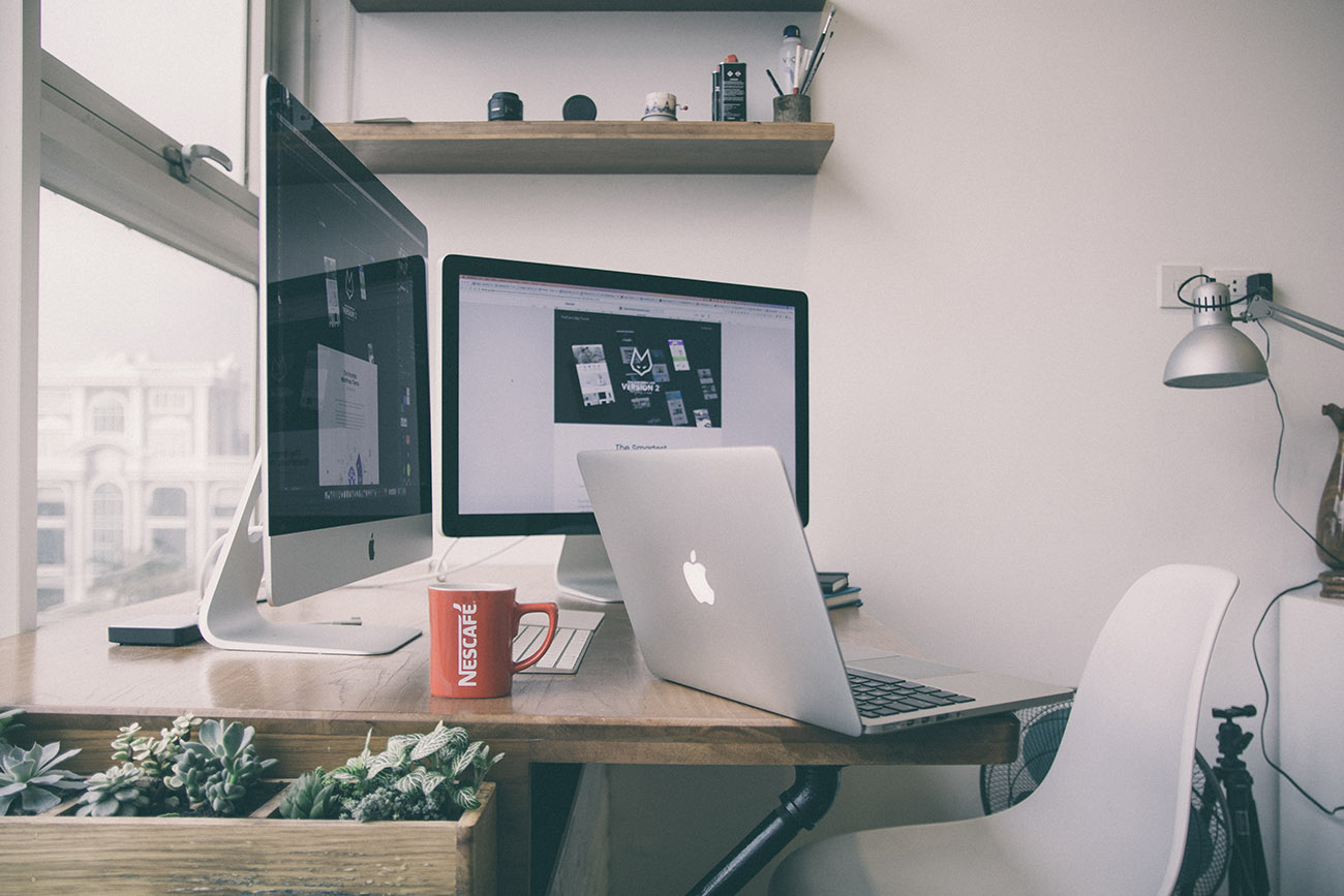
The fact is apparent that the web designing world is changing at a rapid pace, and for the most part, it is actually expanding at the speed of light if not less. However, as the lines separating the real world from the digital world start blurring, there are several design related terms which have spanned through the divide. These old school terms still hold immense importance in bringing classic designing into the advanced world of digital media.
Typography
Typography is the way toward orchestrating the visual layout and overall representation of the entire website – the words, the letters, the images and even the white spaces between them. The readability of a website’s content depends heavily on the arrangement of the consisting text and images. The organisational message and motto should be clear from the visual content and the text used for the content should be guiding the visitor’s from one element to the next one.
Grid
A Grid is a framework made up of evenly distributed, intersecting rows and columns which is used for creating designs. Designers use grids to neatly align and arrange elements in an accurate and consistent manner. You can use columns on your site to help tell a visual story by separating your content into neatly organised and easily comprehensible sections. Grids are helpful in placing content in its appropriate position.
Alignment
One of the most important aspects to maintain throughout a design work is proper alignment of the visual content. The process of alignment refers to the accurate sorting of website’s content in order to enhance the overall balance of the visual layout. Amongst all the designing aspects required in the digital world, Alignment is the once which can be experimented with most. The ongoing industry trends indicate that abstract alignment of visual elements has resulted in the creation of some unique and fresh looking websites.
Kerning
It is referred to the overall spacing of characters and how the white space between two adjacent letters and/or numbers is used. The procedure of adjusting screen elements and layout components improves the website’s readability. Kerning could be visualised as a tight bound box around each letter of any word. These boxes are used in separating the space between letters and how they overlap with each other.
Leading
Leading is used to refer to the gap between each line of text. The correct use of space between textual elements such as paragraphs ensure that the webpage’s readability is not compromised with. Lines of text which do not have proper leading properties specified for them may be difficult to understand by the visitors. Proper and accurate usage of leading results in better looking textual content which enhance the overall efficiency of the website.
Gradient
A gradient could be visualised as a gradual change in the tone of a specific colour, it could be from one colour to another colour, or one colour to a total transparent state. This gradual moderation of colour shades might include more than one colour, or it could radiate from the centre, come from a corner or maybe even span from the top to bottom of the design work. Gradients have found an increased usage in the modern and flat design work as they are more pleasing to the human eyes.
Opacity
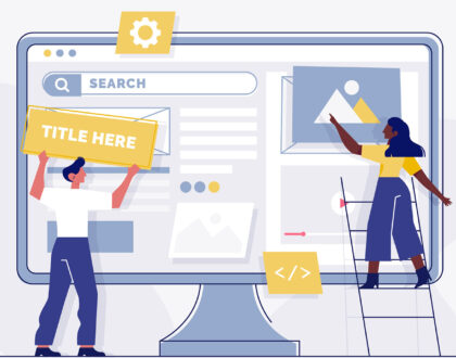
Opacity is one design aspect which is often ignored the most. The correct usage of opacity turns any mundane or boring piece of design into a modern looking piece of art. Lowering the opacity of an element increases its transparency and it lets the user see what is lying underneath the current layer. The cover picture for this blog post has a rectangular box which has its opacity set at 75%, which helps in making the text stand out from the background.
Contrast
The word Contrast describes the difference in color found between the light and dark parts of an image. That is the more popular usage of this word, but it can also be referred to the degree of difference between two visual elements of a website. While color is an essential principle of contrast, it can also refer to type, alignment and size. A website layout where every element is of the same size, shape, or colour is going to look pretty boring, but you can use contrast to make the concept seem interesting.
Designing websites is not all about arranging elements and making the text look attractive, it is a process which requires correct planning and appropriate strategy making. Contact our team, we are experienced in providing the most creative website development services in New Delhi at exciting pricing quotients.
atul
I love to create stunning websites and geeking out in my free time, I hold Masters’ degree in Computer Applications and converse solely in Binary.
Recommended Posts
What do you mean by CSS media queries?
May 27, 2023
How to choose the best web design company in Delhi
April 30, 2023